
Lululemon Design Study
Lululemon design study is one of the redesign assignments of the Advance User Interface class, Web and Mobile Design and Development program at Langara College. In this design study, I focused on aesthetics and user usability to redesign the UI for the 4 main screens, both desktop and mobile sizes. These changes are only for practice and to improve my design skills.
Platform
Desktop, Mobile Responsive
Project
Website Redesign
Tools


Problem and Design Goal
Lululemon is a US-Canadian athletic apparel retailer in British Columbia. Instead of physical stores, Lululemon has developed digital e-commerce platforms: website and mobile application.
Although the current design of Lululemon is quite neat and modern, this redesign can still improve user navigation and enhance the readability of the website. After identifying the issues that needed to be improved, I continued to work on the wireframe to enhance the usability of the website before starting UI improvement.
Figma Working File
Dragging to view or extending to full-screen
(On the mini tablet and mobile view, please view this Figma link)
Wireframes
After clarifying the problem and design goal, moving on to sketching wireframes helps me to target the sections and UI elements that can be improved. Paying attention to wireframes on mobile and desktop also allows me to relocate the layout and distribute the information before adapting UI into the design.
Home page

Categories

Product detail

Shopping cart

UI Redesign
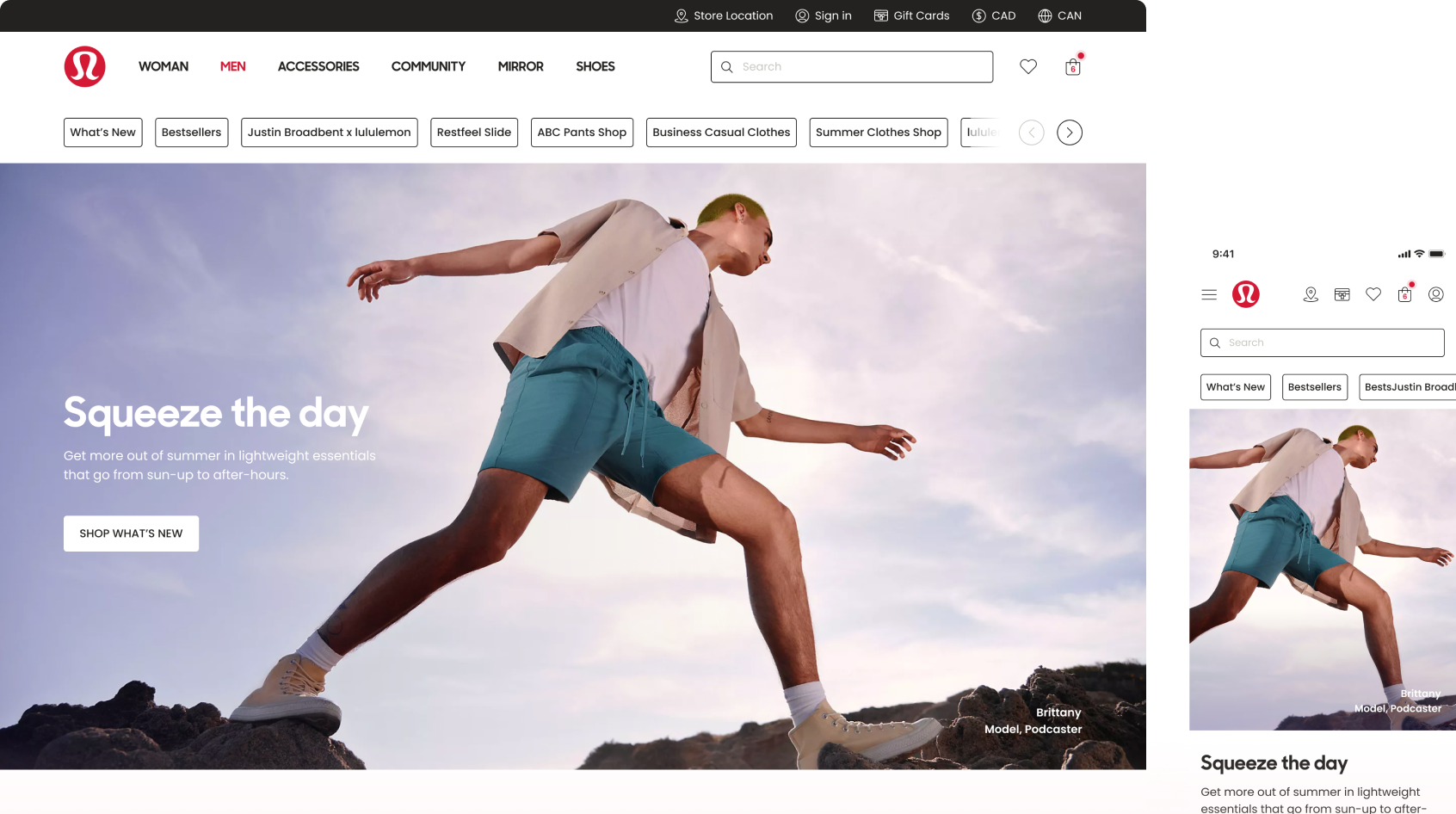
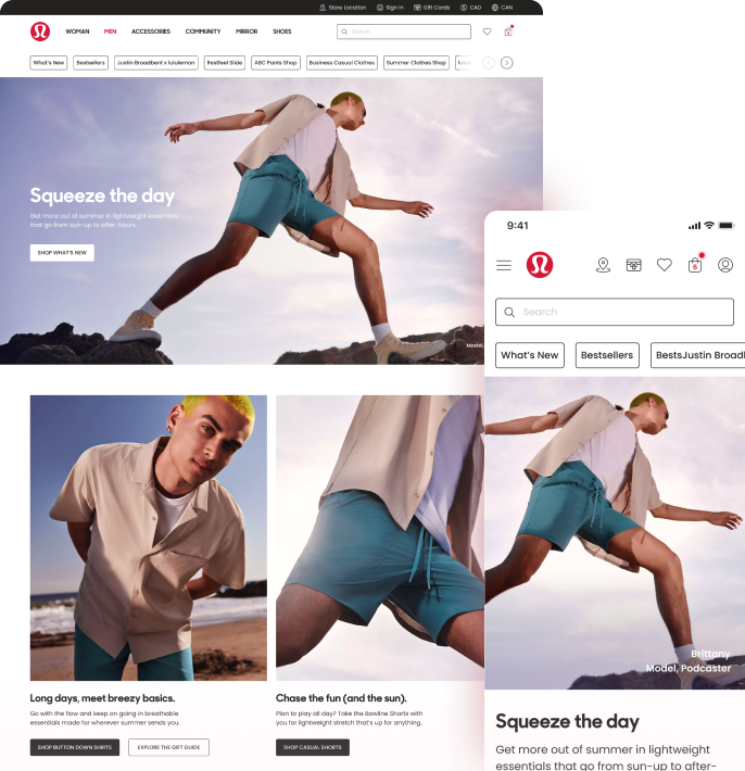
Home page
On the homepage, the improvement of the menu and categories is necessary. The sub-menu was relocated to make space for the hero banner. The mass header was expanded to full width to be more attractive. the section title and the carousel navigation of the carousel were relocated to help viewers navigate without moving the mouse from left to right. Another usability improvement is viewers can add items to their wishlist and view items with other available colours in the same place.

Categories page
The filter of size sections makes users confused because it is hard to know which size belongs to which kinds of items. Therefore, these size sections were separated into specific types. Each filter section was changed to be collapsible to help users navigate filter options easier. Also, the filter bar can be hidden and shown to make space for browsing items.

Product detail page
In the product detail page, the section of item images was changed to viewing all images without clickings. This change helps viewers have a better overview quickly and easily to check product details rather than using the carousel, but the carousel was still kept in mobile size. The re-distribution of product details and reviews was also re-arranged with a better accurate hierarchy.

Shopping cart page
The current design has item info on the left while the price and quantity are on the right which causes the eyes direction of viewers to be confused. Therefore, the item information was relocated with this arrangement: item title, colour, size, item price, quantity, total price, product tags and action buttons (save for later and remove the item)

Mobile responsive screens
These days, mobile-first methodology in web design is always essential as the majority of viewers are using mobile to browse websites. Therefore, designing mobile layouts and desktops side by side helps me to understand how the website will be shown in multiple sizes.

UI Kit
Typography
Lululemon’s visualization expresses the active lifestyle with a bold design in Typography and Photography. A great balance between visualization and white spaces. Sharp Sans Display was chosen to create a dynamic and fresh feeling. Poppins has a good x-height and a variety of font-weight, It also expresses a modern and engaging look that matches the key visualization of Lululemon.

Colour Pallete
For branding compliance, I reuse the brand colours as the primary colours, including red, black and white. Neutral colours from dark to white are used mainly to support the content.

Iconography
Outlined icons were chosen to create a light and unobtrusive design, in order to balance the complexity of the content and easily express the meaning to viewers.
Components
