Splink – Grocery Shopping Event
Splink – is a mobile application that gives users the ability to participate in community-based grocery shopping events, strengthening relationships with neighbours while finding grocery deals. Users can connect to discover good community-focused shopping experiences, and take advantage of bulk item purchasing, as well discount opportunities. The receipt breakdown features allow users to easily split the shopping bill and access more grocery markets outside the digital space.
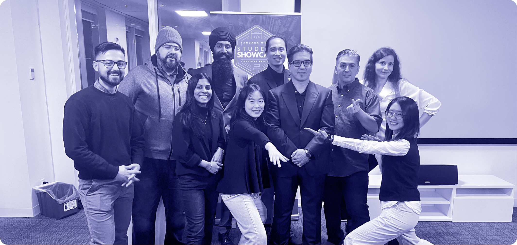
This is a group project that includes 8 teammates from the Web and Mobile Design and Development program at Langara College.
Project
College Project – Capstone
Year
Q4 2022
Constraints
Develop a mobile native app that solves a real-world problem with market and industry examples, and present a live demo
Role
Lead UI/UX Designer (Concept Ideas, Project Planning, User Research, User Flow, Wireframing, Prototyping, Usability Testing, Branding, Hi-fidelity Mockup, Design System, Marketing Assets)
Tools


Prototype
View prototype video
Figma Working File
Dragging to view or extending to full-screen
(On the mini tablet and mobile view, please view this Figma link)
Background
“How might we help newcomers enjoy their lives in Canada?”
The project idea was inspired by the needs of our teammates as international students, newcomers to Canada. Struggling to address the challenges of saving on groceries and managing living expenses in Canada.
Obviously, The rising number of immigrants, international students, and newcomers to Canada have highlighted their struggles in managing living costs, daily expenses, money-saving efforts, and addressing issues like debts and bad credit history.
As international students and newcomers to Canada, we realized that most of us have encountered the same difficulties. Therefore, to address this issue, we came up with an idea to design a social network app that can help neighbourhood members create and join community-based shopping experiences and enhance community connections. Saving a grocery budget and turning a weekly routine into an exciting experience!
Problems
To understand deeply the key problems we aimed to solve, we deep dive into comprehensive research. Our findings, primarily sourced from Statistics Canada, show the following realities:
- Living budget: Newcomers and international students in Canada often struggle to manage living costs, daily expenses, money-saving strategies, debts and credits, which can significantly impact their financial stability and overall well-being.
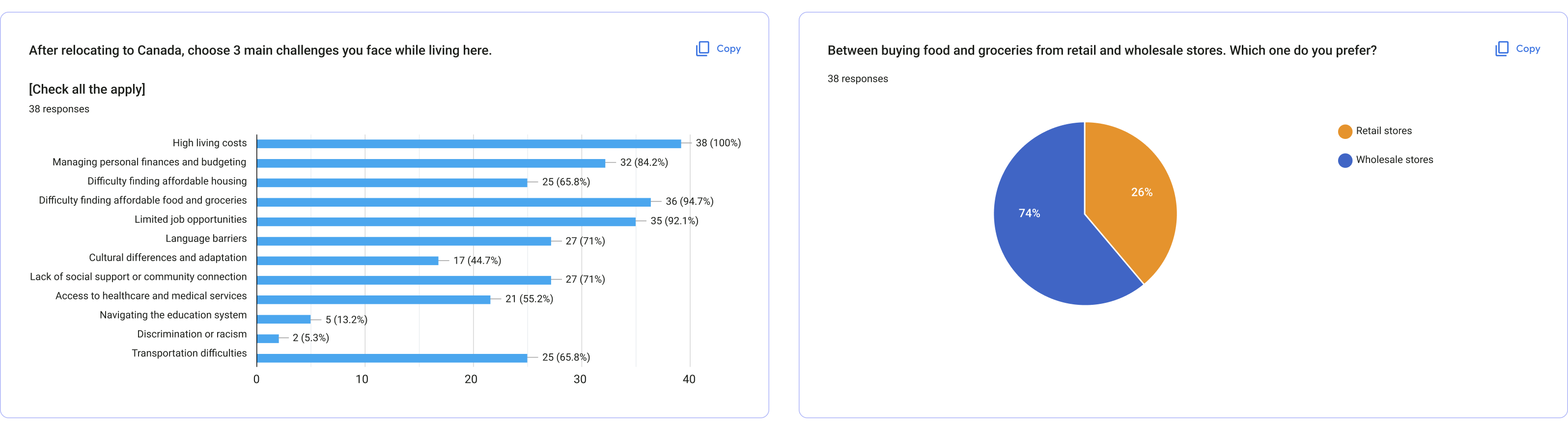
- Food & utilities challenges: The varying prices between retail and wholesale stores requires careful consideration to maximize savings, while ensuring the increase of food waste if buying in bulk exceeds consumption needs.
- Community connection: Newcomers often encounter difficulty in lacking opportunities to stay connected with neighbours to facilitate social interactions and get help from others in the local community.Moreover, our research showed that Canadian residents experience:
Project Approach
An effective user-centric approach from conceptualization to execution
User Research
Empathizing the thoughts, feelings and pain points from user aspects
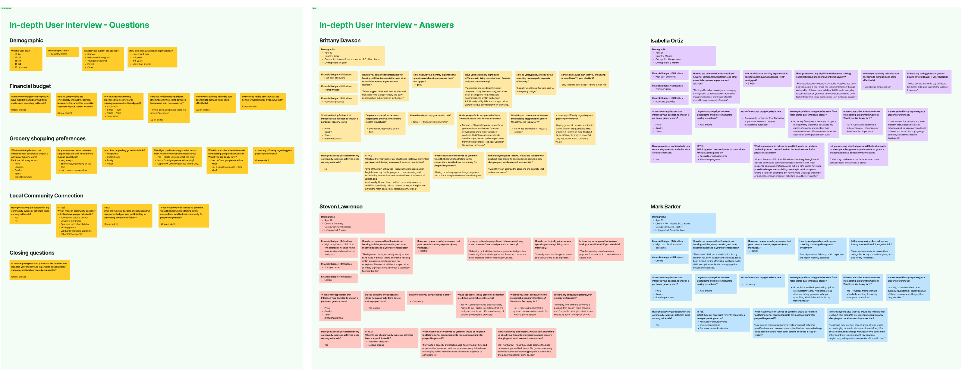
To get into the problem and ensure that our design solutions address the identified issues effectively, we conducted a survey (quantitative data) and in-depth interviews (qualitative data) with 4 people from different backgrounds, including students, newcomers, young professionals and parents. The goals of our user research were:
- Demographic information: Gather information: ages, occupation, location, preferences, etc
- General perception: To grasp general perceptions and experiences when living and purchasing new life in Canada.
- Identify pain points: To identify the challenges they might have encountered or could potentially face.
- Identify needs/expectations: To understand their needs and find solutions, resources could help them to address their challenges.
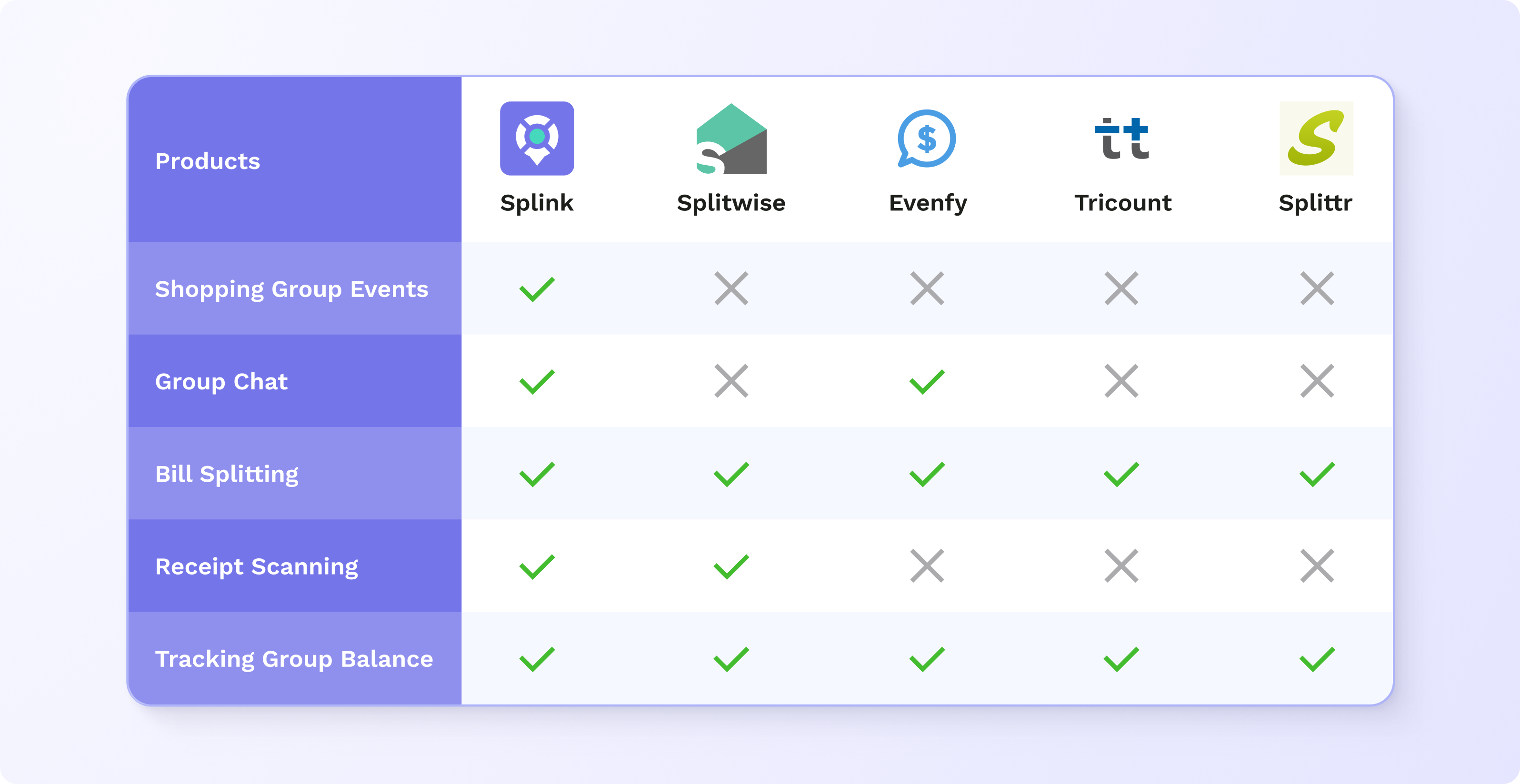
Competitive research – Gain market insights, identify unique selling points
After conducting a thorough analysis of our direct competitors, we discovered a significant gap in the market: there are no budget and financial management platforms that integrate a social event feature. While existing solutions primarily focus on bill splitting and expense tracking, they don’t offer comprehensive features to facilitate group shopping events. Therefore, we decided to develop a unique app that not only provides convenient shopping planning and financial calculations, but also create a community-driven platform that connects people within the same neighbourhood to establish friendly connections through group shopping events.
Define Problems
Synthesize and define the root of problems from research findings
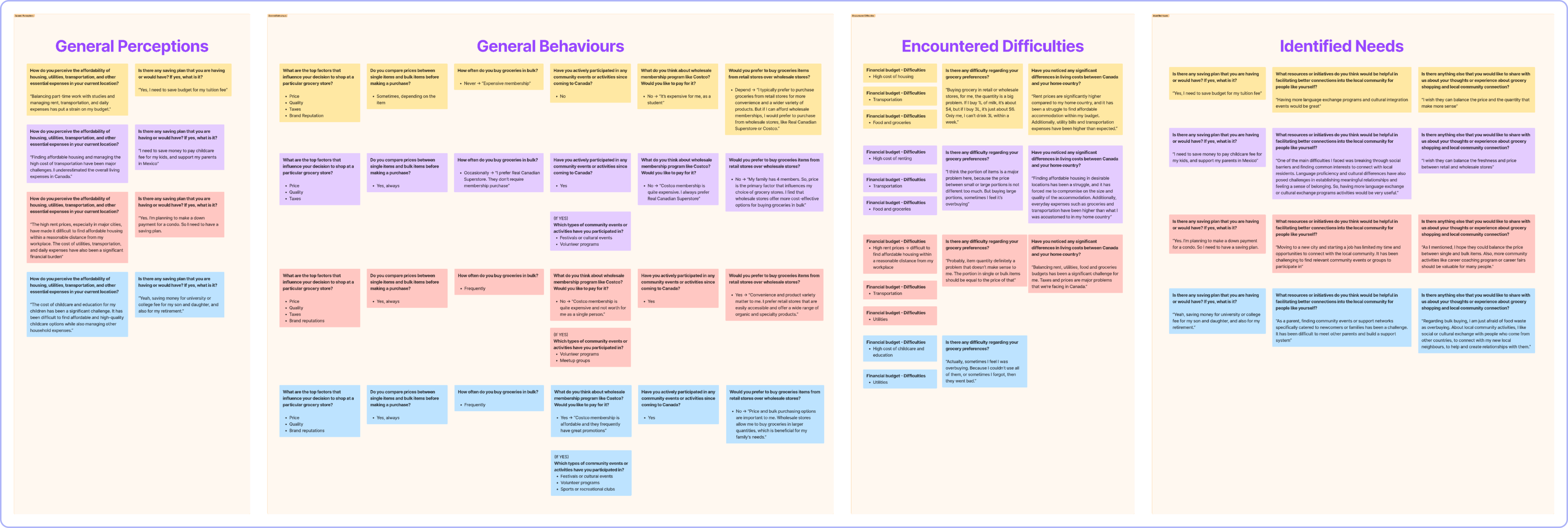
To synthesize research findings, we used affinity diagram mapping to analyze and organize research data into meaningful categories, which helped us to identify common patterns, uncover user needs, pain points, shape design-making direction, design opportunities effectively.
- General perceptions: Participants as international students, newcomers, young employees wanted to settle down their lives in Canada, but often faced financial challenges from utilities, transportation, housing and food that make their saving plans a struggle.
- General behaviours: Regarding grocery shopping preference, participants commonly shared concerns about price, quantity, taxes, and brands. The primary concern revolves around the pricing of single versus bulk purchases, leading many to prefer buying in bulk, but worry about wholesale memberships and potential issues with overbuying.
- Encountered difficulties: Participants faced common challenges with living expenses, including housing, utilities, transportation and groceries, which impact their financial saving plans. Especially, they express concern about the pricing of single and bulk items when shopping for groceries in Canada.
- Identified needs/expectations: Balancing the pricing of single, bulk items and avoiding food waste are key expectations from participants. Additionally, they express a strong desire for more local community events, such as language and cultural exchanges, job fairs, and networking programs.
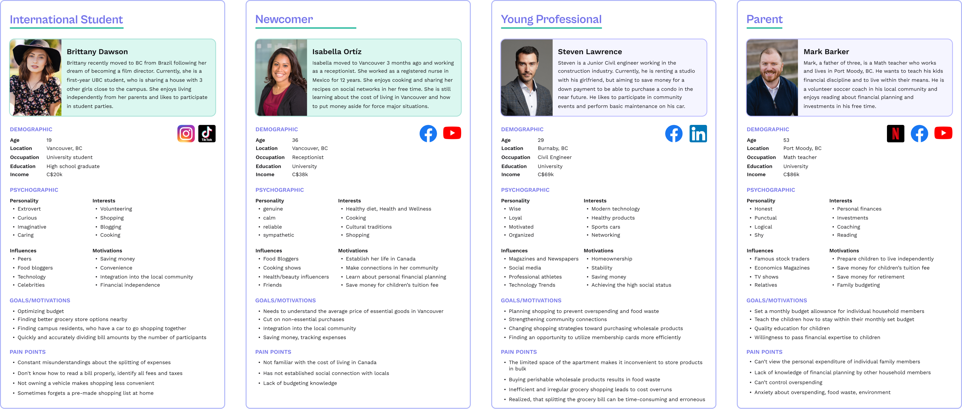
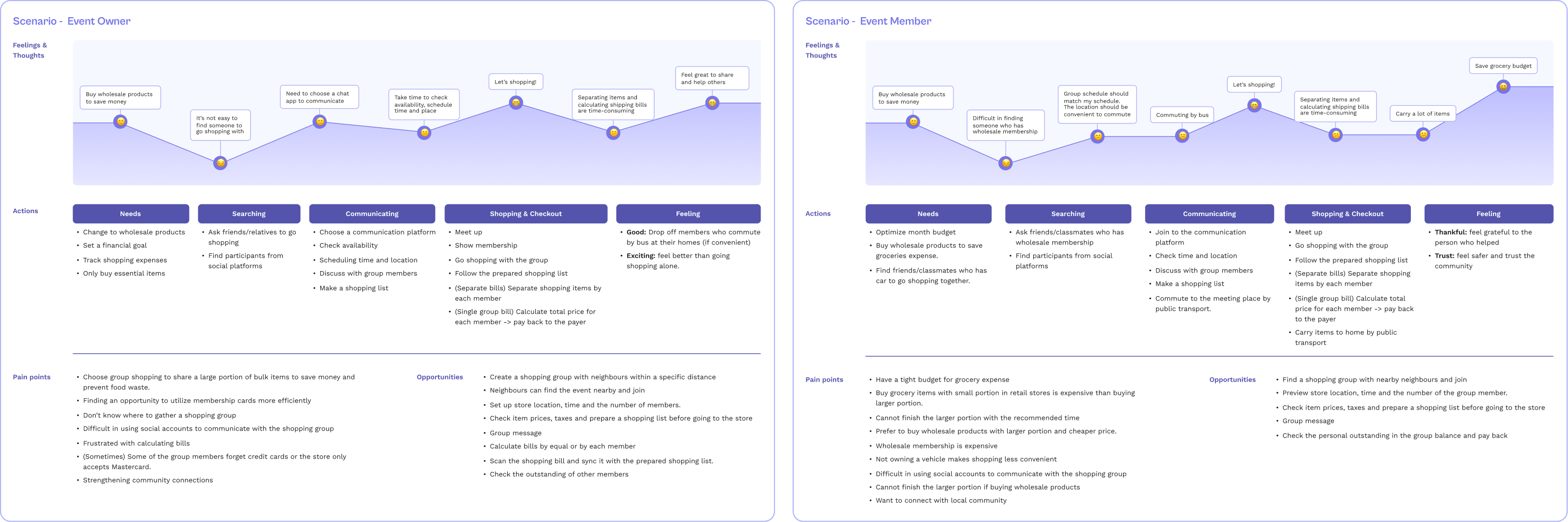
User Persona & User Journey Maps – A clear picture of target users/customers
Based on results from synthesizing research data, we continually created user personas to humanize our target users, empathize with their pain points, and expectations. Additionally, the user journey maps support us to gain a deep understanding of their thoughts, actions, feelings, obstacles throughout the setup scenarios. All of them assisted us in shaping user-center design to the forefront of design process, leading to more effective and successful products and business strategies.
Solutions
Creating a user-centric design direction and enjoyable mobile app with essential features
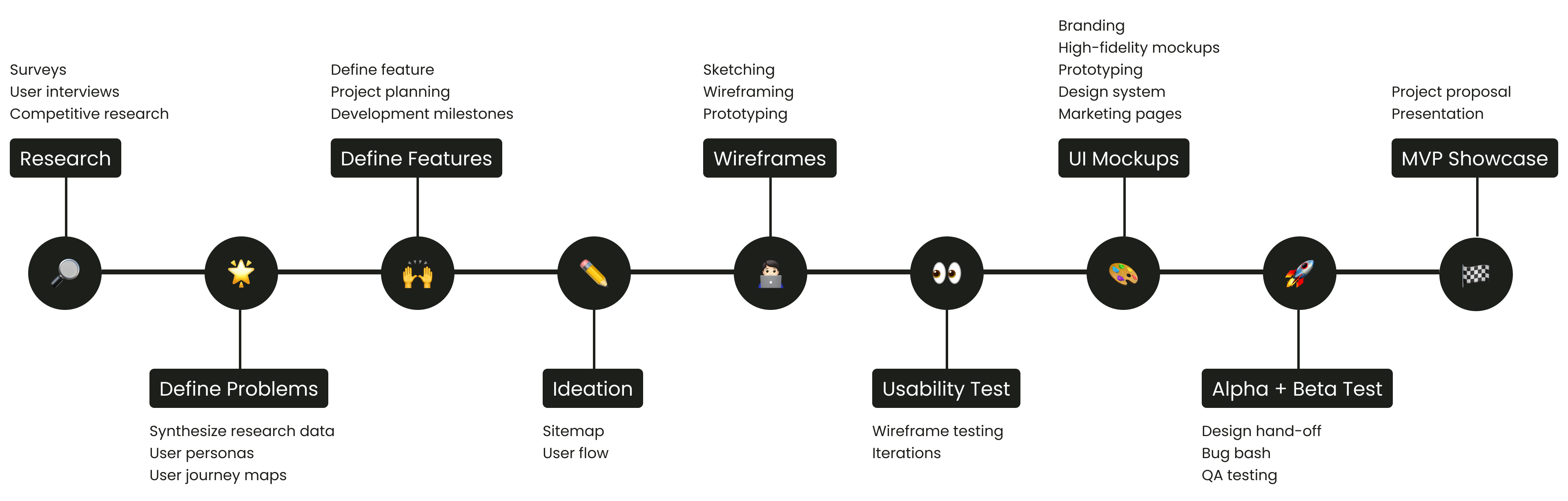
With a clear understanding of user pain points and expectations, we reassessed our initial assumptions, findings and ideas to inform the design direction and features of Splink. We defined our project scope with 5 key features to help users create or join shopping groups and make joint purchases, splitting the bill afterward. It’s not only convenient and economical but also enhances community connections and turns a weekly routine into an exciting event.
- Shopping Groups: Offer a unique shopping experience to your community by creating a shopping event, discussing details, managing groups and keeping track of your contacts and group activity history.
- Receipt Scanner: Process and convert receipt details into payments and map them with a pre-planned shopping list for accurate outcomes and time savings.
- Splitting the Bill: Split the bill easily and precisely in equal portions or based on the cost of items purchased by each group member
- Tracking Group Balance: View group balance at your convenience, keep track of payments made by each member and receive notifications so you would never miss a payment.
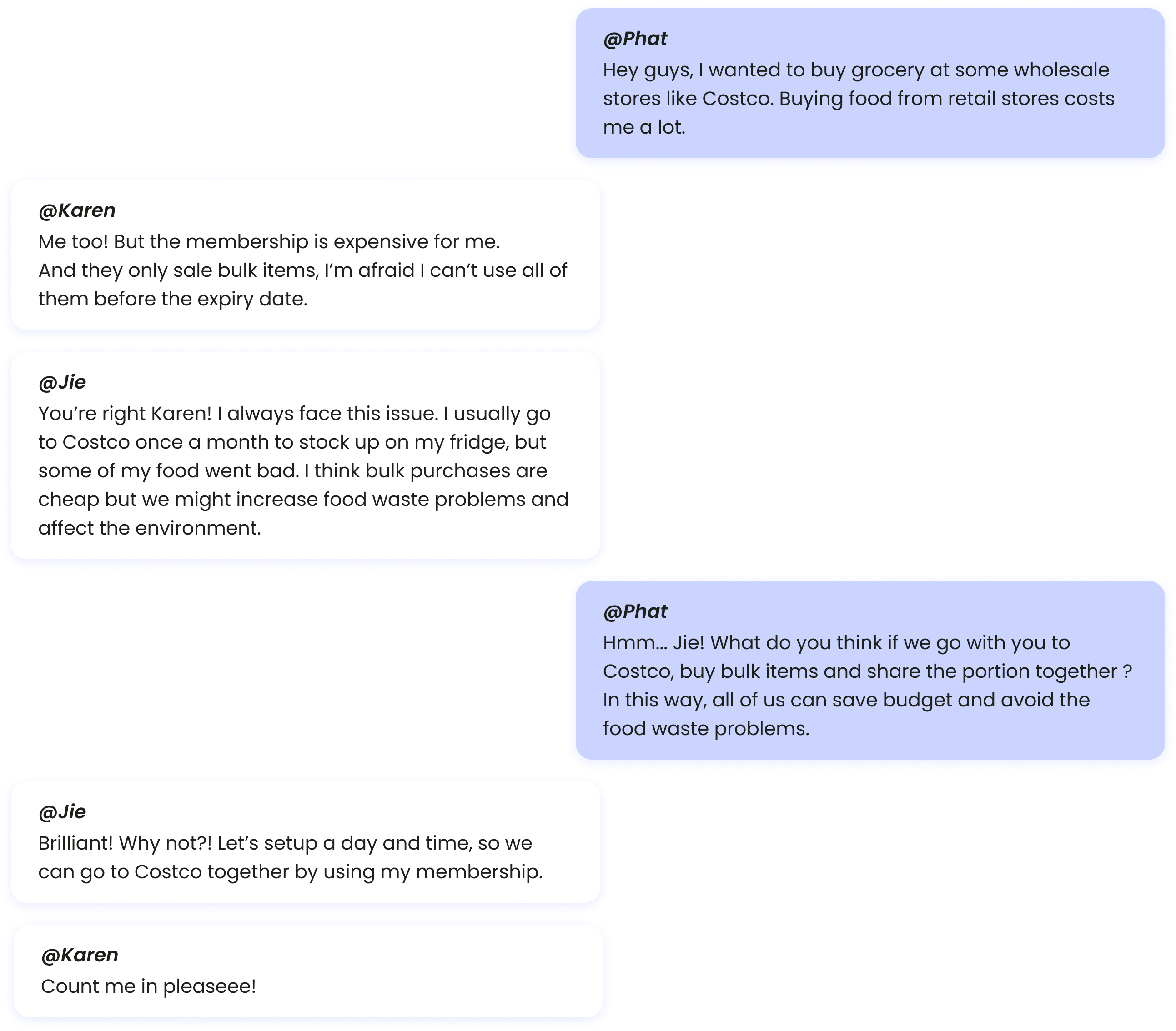
- Group chat: Communication between members of the shopping group is carried out by exchanging text messages, photos, or images downloaded from the gallery or taken with the camera phone. The user can search chat messages by inputting keywords into the search field, archive (host only) or leave a discussion if the group balance was settled, and review previously archived discussions.
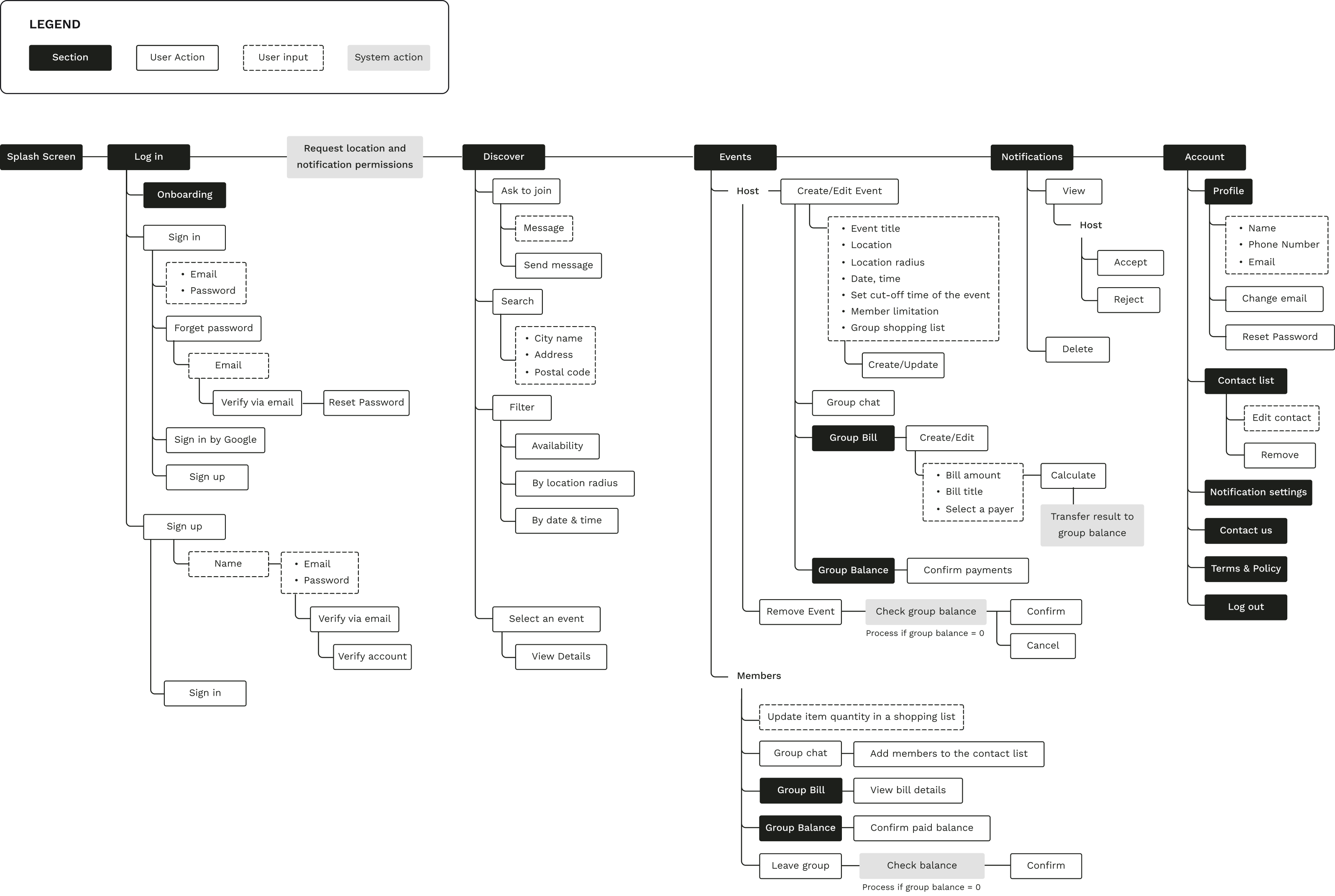
User Flow
A valuable UX deliverable that helps visualize user interactions and an easy-to-understand format, facilitating better team communication and collaboration.
Keeping the user-centric approach during our design process, we began ideation section by creating a user flow based on our research findings and features. Our objective was to visualize the flow of a user’s journey, from creating/joining a shopping event to splitting the group bill and managing the group’s outstanding balance through the mobile app, showcasing the steps users will take to achieve a specific goal, and fostering a shared understanding between designers, project manager and developers to understand the overall structure and organization of the proposed design solutions.
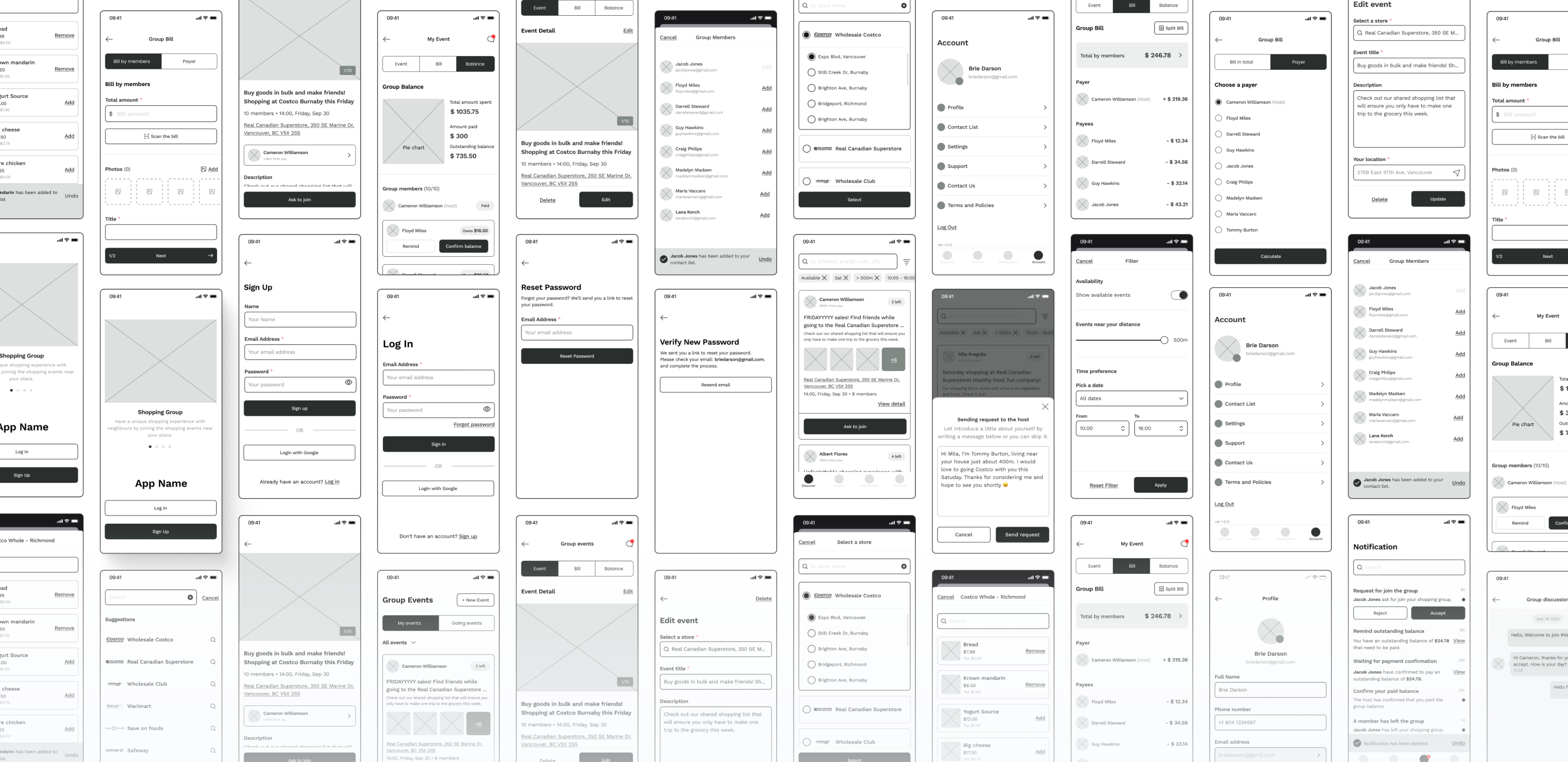
Low-fidelity Wireframes
An effective UX approach to conceptualize visual representation, focus on functionality and usability, gather feedback and iteration to save time and effort.
Moving on with creating low-fidelity wireframes, we took time to explore different layout options, precise information hierarchy, and content placement without getting caught up in visual details. We focused on essential components, enabling designers to concentrate on the functional aspects of the design, gathering feedback and suggestions on the core functionality and content structure. This approach helped us determine the most intuitive and efficient user interactions and user flow, subsequent design iterations, saving time and effort in the design process.
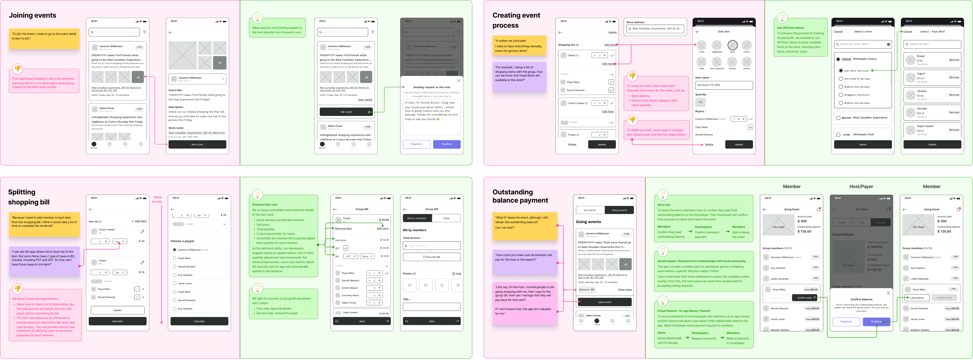
Design Iteration
Validating assumptions, achieving user-centred solutions, continuous improvements that meet the needs and expectations of the target audience.
Before moving on to UI creation, we created rapid prototyping and tested with actual participants, who are our classmates and relatives. During the testing sessions, we received many great feedback, thoughts and questions when participants interacted by joining events, creating events, splitting shopping bills and managing outstanding balance payments. From this, we could validate our design assumptions and hypotheses about user behaviour, preferences, find improvements to address usability issues, and optimize user flows, information hierarchy and user interactions.
UI Mockups – Main features
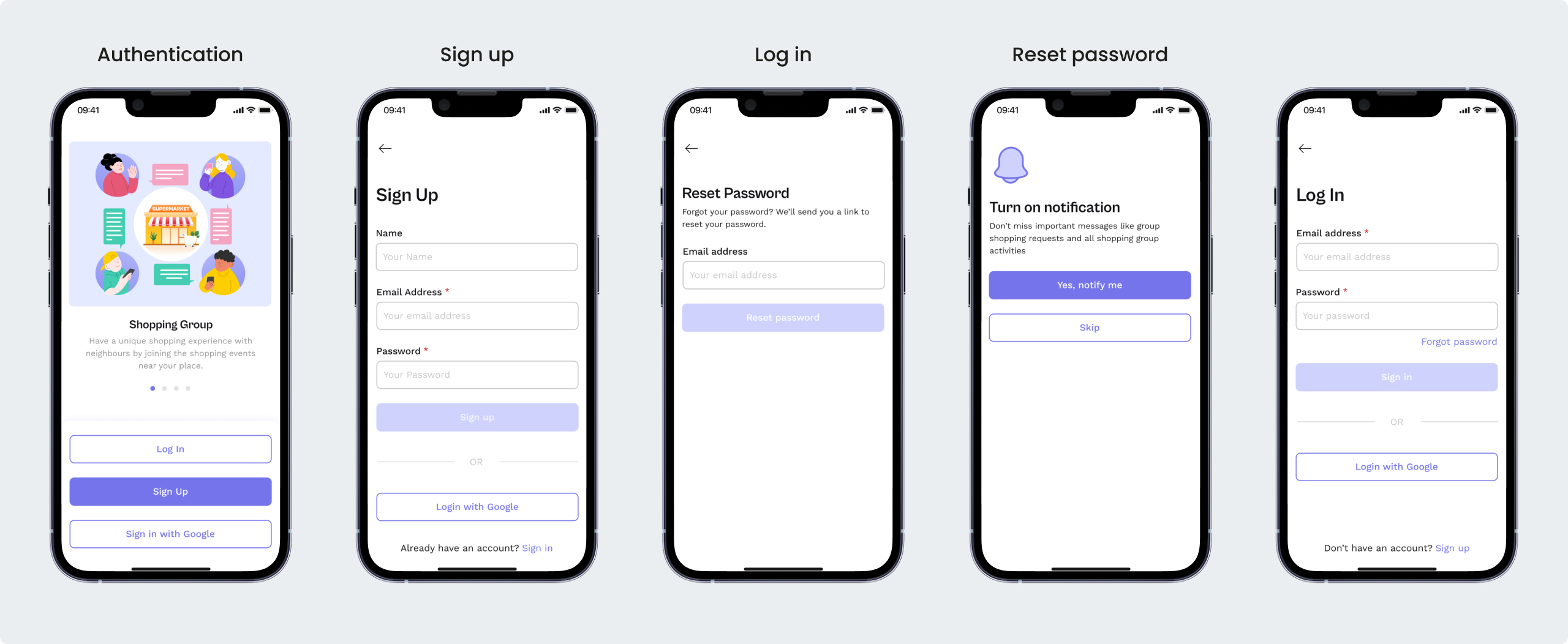
Authentication
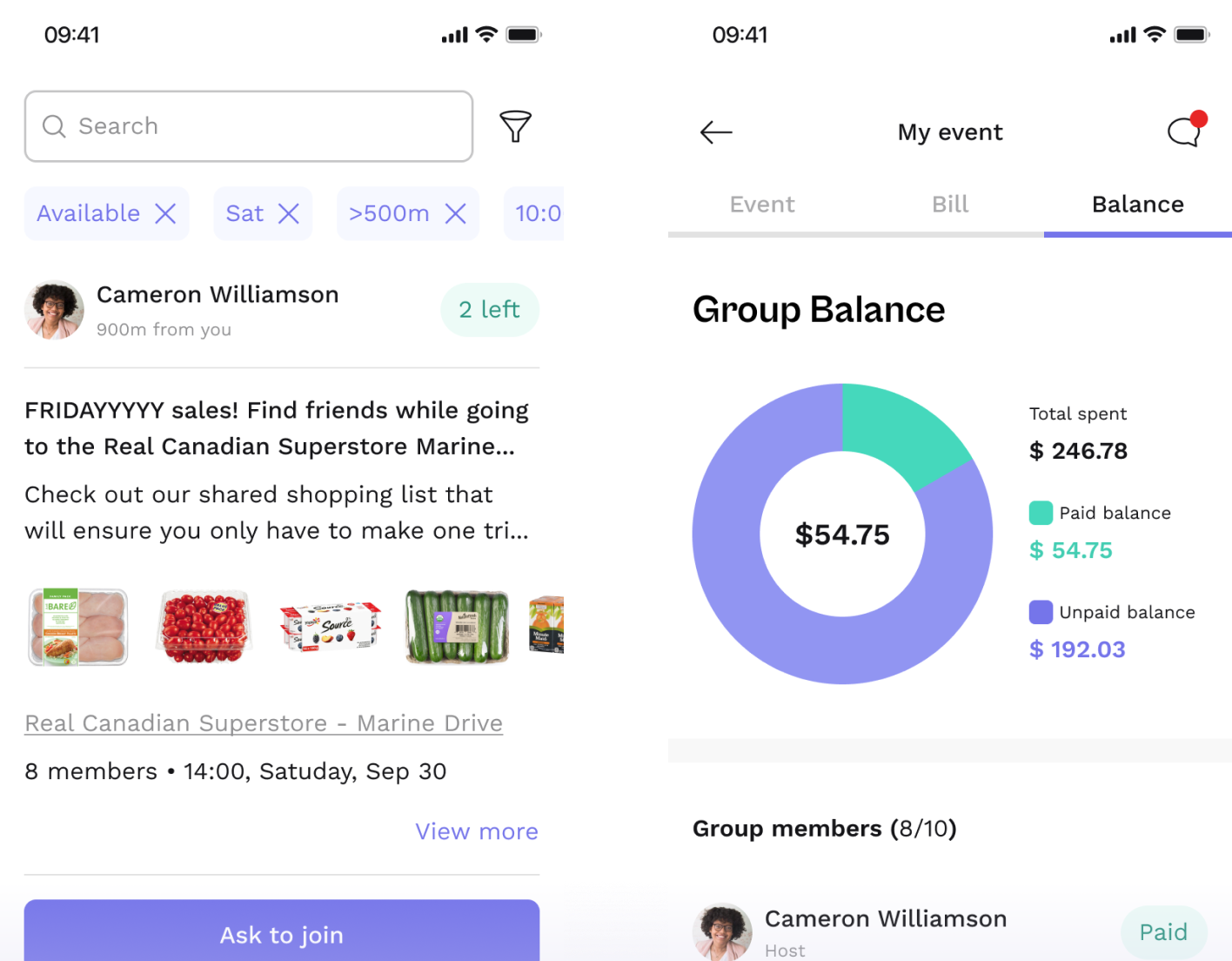
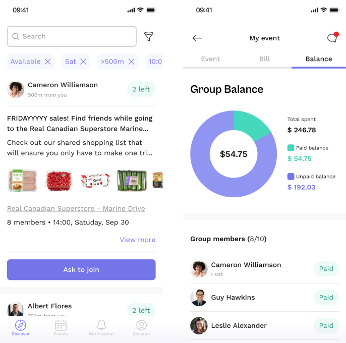
There are 2 sign-up methods in the authentication section, which include manual sign-up or Google. The app used email verification to verify user accounts and passwords. After sign-up or log-in in successfully, the app would prompt the location and notification permission from the user’s mobile if they haven’t been given access. The location permission must be allowed to create events or search for nearby events within the user’s radius from 0m to 500m.
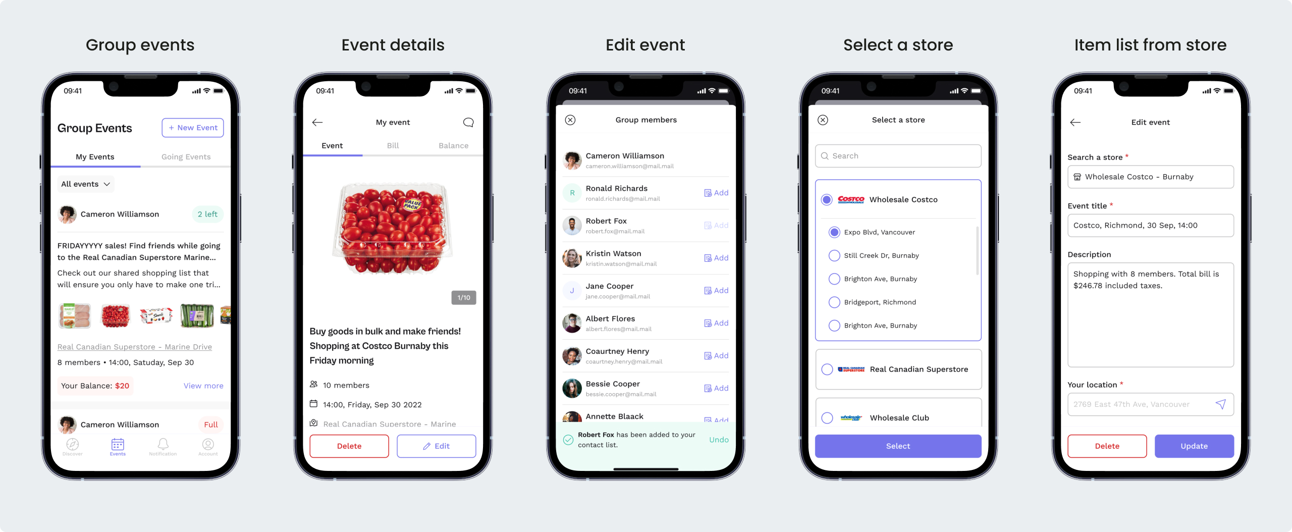
Shopping Groups
The user can create a shopping event, providing details and a preliminary shopping list. Or check ongoing events in the neighbourhood and ask to join a group that meets users’ needs.
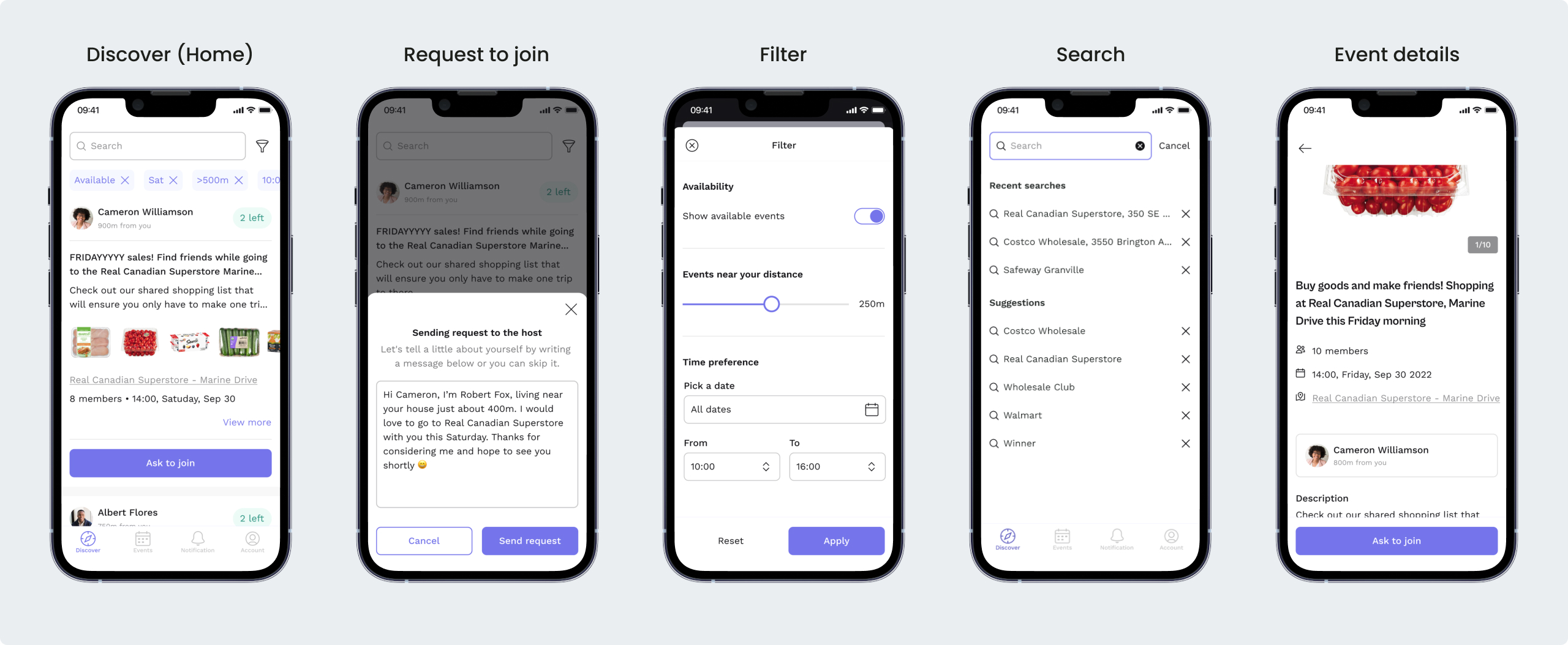
Group Events Management
On the group events screen, users can manage their created or joined events and check the outstanding group balance. The event owner: publish the event by setting up a date and time, store address and name, number of participants, shopping list, etc., control the composition of the groups, bill splitting, payment process, and send reminders to payers. The event members: send a request to the host, input the number of items to the shopping list, discuss event details, share photos in the group chat, and see the group balance (the total and by the member).
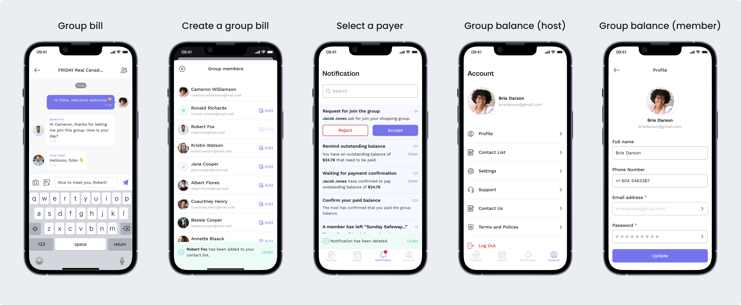
Splitting bills & tracking group balance
The easy and fast process of in-app receipt recognition as well as the flexibility to choose a payer and method of bill splitting: equally or by members improves the user shopping experience. When splitting the group bill, the event owner can use the camera to capture/upload shopping receipts in order to convert receipt details into payments by mapping them with a pre-planned shopping list.
Tracking group balance allows tracking the shopping group balance presented transparently and accurately. Users will be notified about payment updates and send or receive reminders to avoid payment delays.
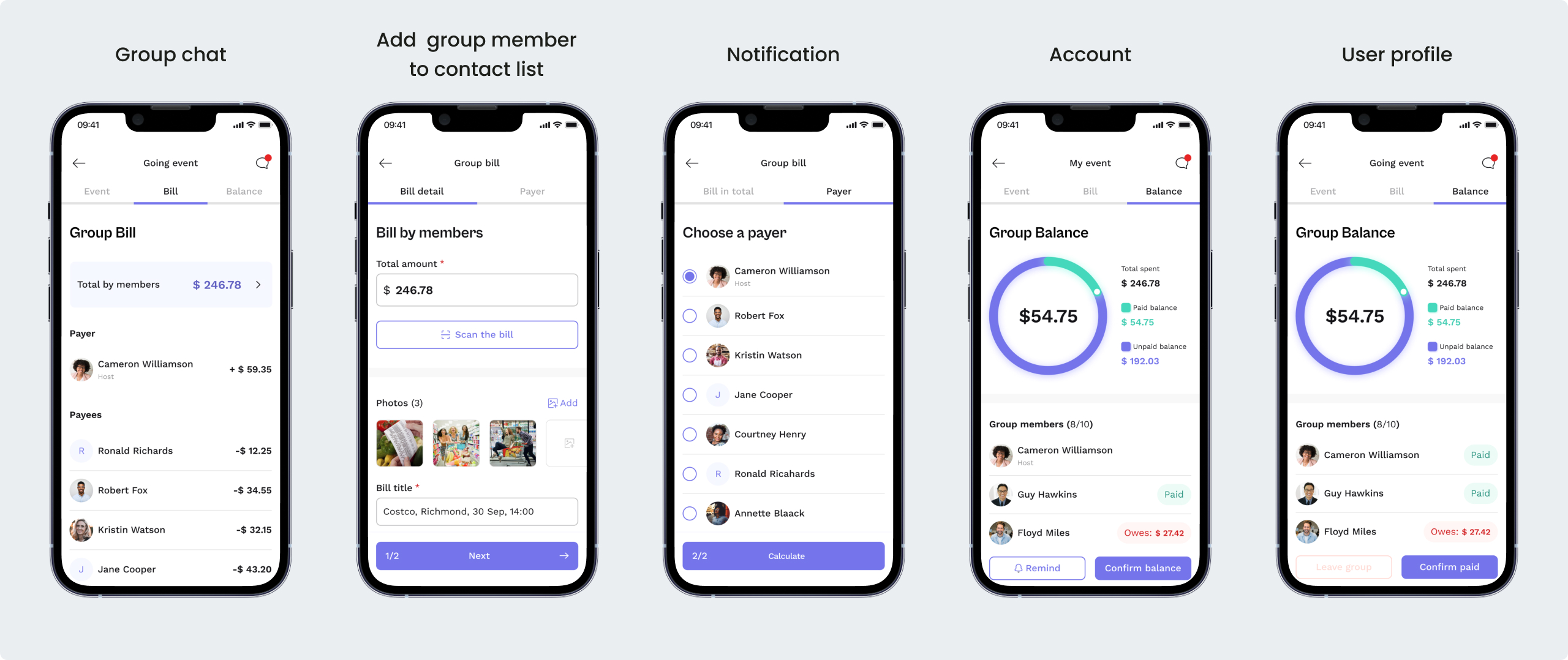
Group discussion, notification & account
The chat function helps to clarify all the details before the event, exchanging messages and photos between group members. Notifications convey information and updates, encourage users to engage with an app, and send reminders. An account allows the management of users’ personal data, contacts, and settings.
Branding
Our logo is multi-symbolic and represents the following concepts: community, connection, location, and sharing. At first glance, it reminds us of a map location sign, but the bright circle inside can be interpreted not only as a meeting point but also as a close circle of people, unification, and rallying. Clear lines leading to the circle resemble a road, an intersection, which indicates movement and organized activity.

User Interface Section
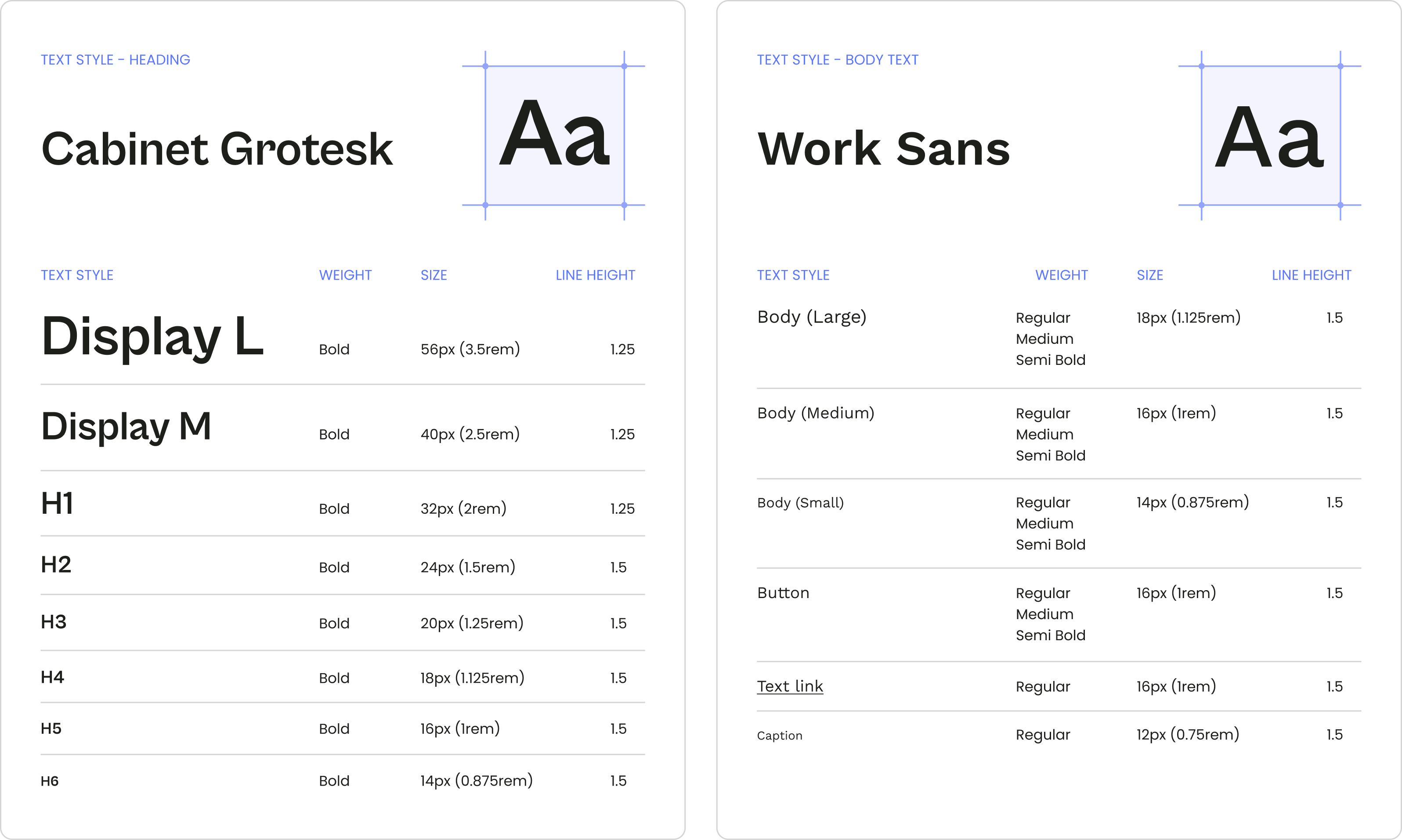
Typography
Fonts directly affect the user experience when navigating through an application. Therefore, readability, regardless of screen size, was a decisive factor in their selection. For the body text, we chose Work Sans, a sans-serif inspired by the early Grotesk with nine variants of weight. Cabinet Grotesque is a modern, uniquely crafted sans-serif font, that was used primarily for the header
Colour Pallete
The medium slate blue colour represents creativity, playfulness, wealth and happiness. While the light sea green colour expresses freshness and young. The combination of these colours can easily attract human eyes on all digital platforms.

Iconography
The choice of iconography was dictated by the desire to create a light and unobtrusive design, in order to balance the complexity of the content. Outlined icons also work well with typography and content structure throughout the app
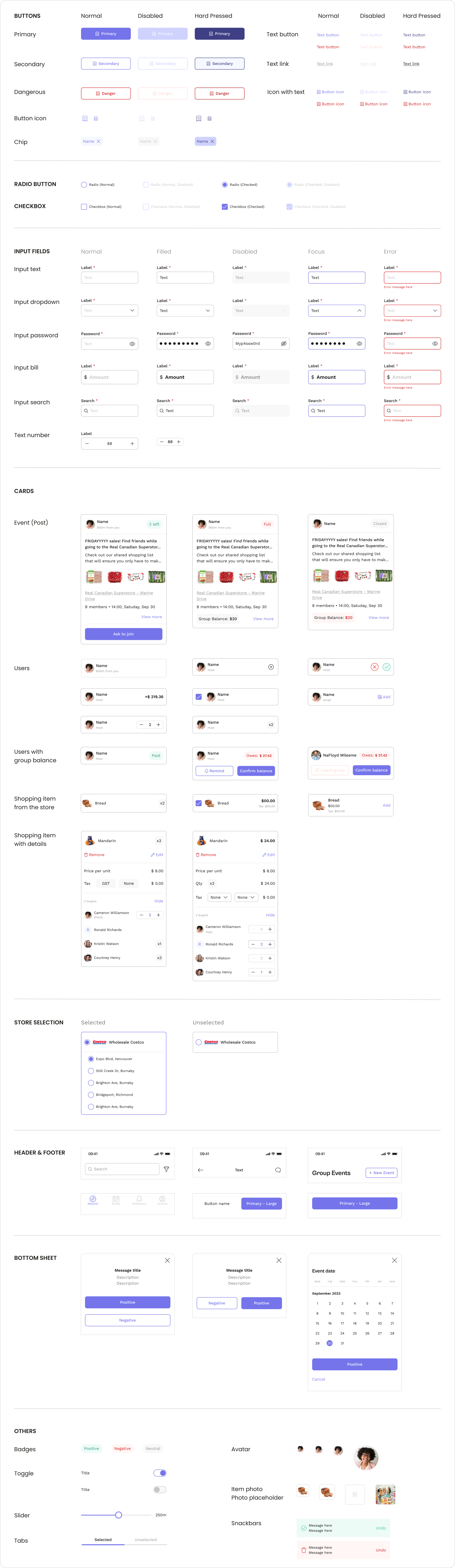
Components
Splink has a dynamic UI kit with all important states from normal to long-pressed or dangerous. It helps us adapt the design to all situations and maintain design consistency.
My Amazing Team
Designing and developing SPLINK from scratch in 12 weeks would not be possible without these incredible teammates: Valentina Abanina, Shijie You, KaranPal Singh, Heywon Kang, Thushara Suresh, Taras Ivanov, and Jaskaranvir Deogan.