
Kijiji Design Study
Kijiji design study is one of the redesign assignments of the Advance User Interface class, Web and Mobile Design and Development program at Langara College. In this design study, I focused on aesthetics and user usability to redesign the UI for all potential screens of Kijiji’s mobile application. These changes are only for practice and to improve my design skills.
Platform
Mobile Application
Project
Mobile application redesign
Tools


Problem and Design Goal
Kijiji is the most popular online classifieds advertising website in Canadian and is part of eBay Classifieds Group. Kijiji has both a website and mobile/tablet applications (AppStore and PlayStore).
The current design of the Kijiji mobile app has main problems with layout, navigation and iconography. After identifying the issues that needed to be improved, I continued to work on the wireframe to improve the usability of the website and then improve the UI style, layout, colours and icons.
Figma Working File
Dragging to view or extending to full-screen
(On the mini tablet and mobile view, please view this Figma link)
Wireframes
After clarifying the problem and design goal, moving on to sketching wireframes helps me to target the sections and UI elements that can be improved. Paying attention to wireframes also allows me to relocate the layout and distribute the information before adapting UI into the design.


UI Redesign
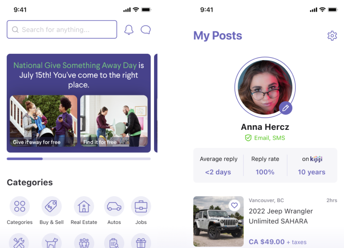
Home screen
In the home screen, the categories were relocated to underneath the banner and it shows all categories as well. By adding a chat icon, users can access messages faster while browsing on the home screen. The view of items can be switched between a 2-column view and the list view. In the item card, a bookmark button was relocated and also added location and posted time to the post.
Search results
The “save search” button was relocated next to the search bar to help users’ actions be more efficient. Besides, the “sort & filter” button is also moved underneath the search bar for easy interaction.

The filter
In the filter, each field will redirect users to the next screens to see more options. I changed this by using the dropdown list to help users view the options more quicker and easier. Also, the use of chips, slider and toggle tokens allow users to change and select the options faster without going to another screen.
Search results
In the screen of post details, the save post button and share button were relocated to the top of the screen. When scrolling down, users can easy to access these buttons rather than go back to the top to see them.

Creating a new post
The UI of creating a new post was improved pretty much to be cleaner and more obvious. The dropdown list and toggle tokens were rescued from the filter, this avoids redirecting users to another screen while filling in the new post.
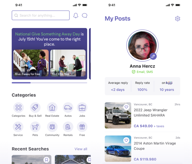
My posts & notification
The UI of my posts was enhanced to be prettier. Users can upload their profile picture quickly on this screen. Besides, the UI of the notification card limited the length of the content in order to keep the layout tidy and consistent.

chat, favourites & map view
The UI of the messages screen, favourites screen and viewing map screen was improved pretty much to be cleaner and more obvious.

UI Kit
Typography
San Francisco Pro was chosen to create good readability, elegance and cleanliness. It has a good x-height and a variety of font-weight. The typeface also enhances the simplicity of the design.

Colour Pallete
For branding compliance, I reuse the brand colours as the primary colours and extend tints and shades for various uses. Neutral colours from dark to white are used mainly to support the content.

Iconography
Outlined icons were chosen to create a light and unobtrusive design, in order to balance the complexity of the content and easily express the meaning to viewers.
Components
