
Expedia Design Study
Expedia design study is one of the redesign assignments of the Advance Graphic Techniques class, Web and Mobile Design and Development program at Langara College. In this design study, I focused on improving Expedia mobile application, including the user experience, usability, architecture information and user interface for all potential screens. These changes are only for practice and to improve my design skills.
Platform
Mobile Application
Project
Mobile Application Redesign
Tools


Problem and Design Goal
Expedia Group, Inc. is an American online travel shopping company for consumer and small business travel. The current design of the Expedia mobile app has main problems including the lack of information distribution, the length of property information detail, the usability in search properties and the repetition of user account info.
In this design study, I limit my design goal to focusing only on the “Stay” section. The design goals are adjusting/restructuring the information distribution, tidying up the property information detail and improving the usability as well as the interface of the app.
Figma Working File
Dragging to view or extending to full-screen
(On the mini tablet and mobile view, please view on Figma)
User Flow
After clarifying the problems and design goals, moving on sketch user flow is an essential step. User flow helps me to understand the general operations, key features and functions of the app. In this design study, the user flow was added more information sections in the home screen (discover, property types, blogs/news), improved the filter, property (hotel) details, “Trip” section and restructure user profile in “Account” section.


Wireframes
After clarifying the problem and design goal, moving on to sketching wireframes helps me to target the sections and UI elements that can be improved. Paying attention to wireframes also allows me to relocate the layout and distribute the information before adapting UI into the design.


UI Redesign
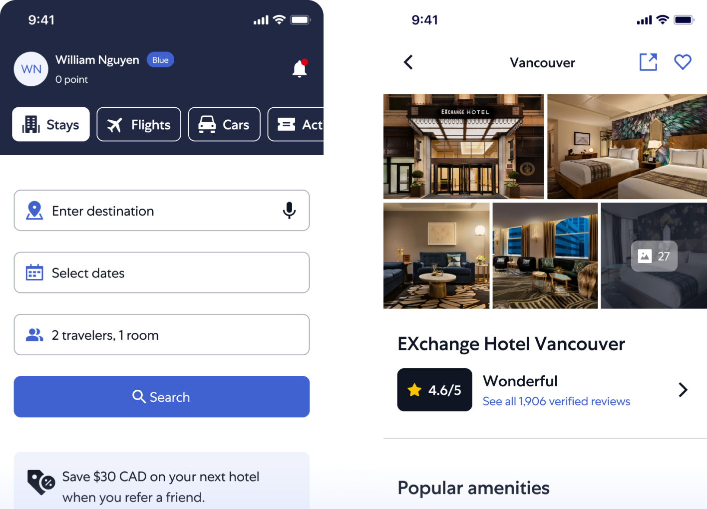
Home screen
In the home screen, the header was redesigned by adding user info with membership and redeem points. The categories were changed to the carousel. Besides, input fields on the search screen were relocated to the home screen, in order to allow users to search directly without redirecting to the next screen. The discover, property types and blog sections also were added to attract users while browsing. Furthermore, other sections were improved by adding more cards.
Search by location
In the search by location screen, the search icon was relocated from inside the filter to outside the header. It allowed users to search property names quicker rather than placing the search function inside the filter. The property card was improved UI to make it cleaner and better info distribution. Also, showing the number of available properties next to the filter button to help users know how many properties are matched their needs.

The filter
In the filter, the search field was relocated to the search by location screen. The UI was improved to make it more obvious and cleaner.
Trips
In the trips screen, all trip plans were displayed in one place, users don’t have to tap on the “See all” button to view more trips. In the trip details, the header added tabs to help users quickly access the section they need to view (bookings, saved, stay, cars, activities, about destination). All items were stored in the saved item section, the item card is also redesigned to make the UI consistent with card components on other screens.

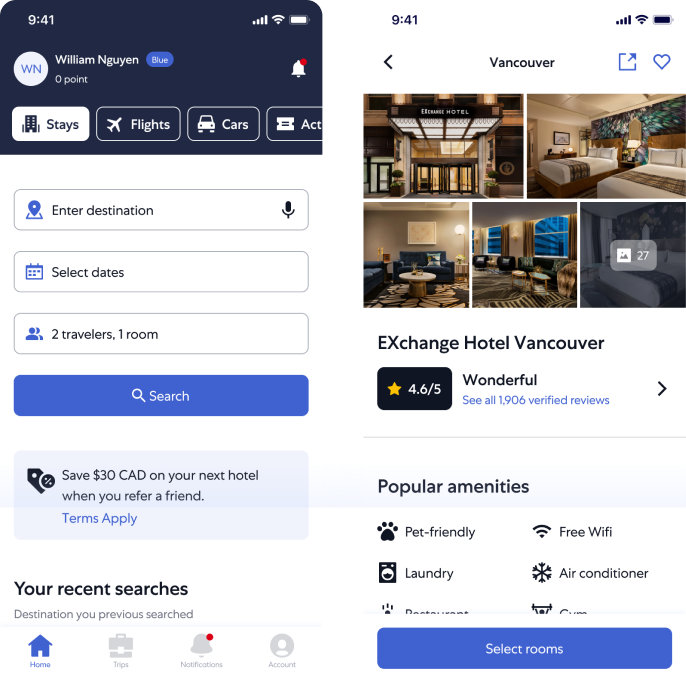
Property Details & Selecting rooms
In the property details screen, the layout of property images was changed to show more images at one time, this delivers more information to users than using a carousel to view a single image per sweeping. The rating and reviewing section also improved the UI to make it more obvious.
In the existing design, the property details screen is a super long screen. Therefore, reducing the length of the screen is necessary. To do that, all room selections were relocated to the next screen after users tap on selecting rooms buttons in the “select a room” section as well as the bottom button. Additionally, all information on the property was moved to large sheets after tapping on them to view more.

Account & My account info
In the account screen, the user’s avatar was added and the membership points section was redesigned to make it obvious. Once the user scrolls down, the header will show up with user info and it is fixed on the top. Sections in my account info screen were relocated to the account screens. In my account info screen, Expedia is using web view and some sections are repeated on this screen and the account screen. To improve the current info structure of my account info screen, the overall user info and “My travel details” sections were removed. Also, all tabs including “Other travellers”, “Expedia rewards”, “Coupons and credits”, “My reviews”, and “Privacy and Security” were moved to the “Account” screen.

UI Kit
Typography
Expedia is using the Centra No1 font family in their website and mobile app. According to gooova.com, this typeface was created by Josh Finklea. In this design study. I reused Central No1 as a brand front throughout the design study.

Typography
For branding compliance, I reuse the brand colours as the primary colours and extend tints and shades for various uses. Neutral colours from dark to white and supporting colours are used mainly to support the content.
- Brand colours: are used in membership labels and discount labels; such as VIP Access, Member Prices, 30% off
- Primary colours: are mainly used for buttons, tabs, icons, checkboxes, radio buttons, and other essential elements.
- Neutral colours: are used in text styles, icons
- Supporting colours: are used in discount labels, alert messages, notification indicators and bookmarks.

Iconography
Solid icons were chosen to highlight the content and create an attractive design, in order to balance the complexity of the content and easily express the meaning to viewers.
Components
